Friday, April 22, 2011

Spring Market

For the first time this year I attended the High Point Market in High Point, North Carolina to see all of the latest and greatest furniture and accessory lines.  I attended with several interior designer friends and made a few days of it.  I rarely get back to the state of North Carolina since the 4 years I spent in Durham during college, and it was a treat.  Although, I can't imagine spending time in High Point, NC if Market was not going on.  In fact, we spoke to a "waiter" at one of the restaurants who said that he is a lawyer by trade but during the week of Market, he takes time off to moonlight as a server because that is how much money he makes. 

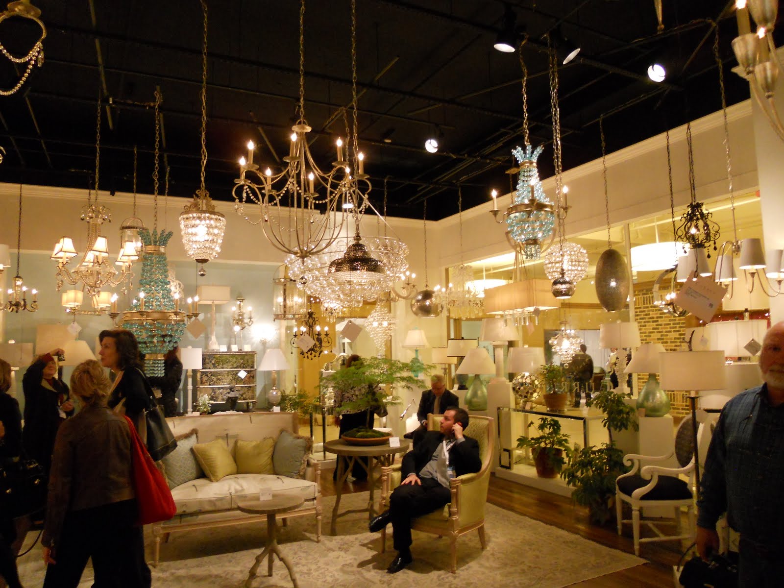
Anyway, I found this trip to be extremely worthwhile and even managed to have quite a bit of fun in the process!  I found some great pieces and new resources for clients.  I am including a bunch of photos I took from various showrooms we visited.  Enjoy!


Loving the turquoise

Loving the miniature furniture at Oly


Fun with silhouette art outside of the Christopher Guy showroom with my travelling companions and fellow designers, Meredith and Gillian
Little fun/quirky/pretty things that caught my eye that I just couldn't resist snapping photos of...
Too cute with the little duck feet!

Totally bizarre but certainly a conversation piece...

Fun silver garden stools, great as end tables!

My nautical obsession drew me to these hooks.  Great for a beach house mud room...


Love this side table!


Love the shape of this chair back

What a fun gift for a teacher, love these bizarre little brass apple scuptures

Great for indoor or outdoor on a table, maybe filled with succulents...
Just a little overview of some of what I saw at Market this year.  Looking forward to the next Market in the fall and meeting up with all of the friends I made this time around.

Have a great weekend!

C (&M)

Wednesday, March 23, 2011

POP

I have always had a slight obsession with the work of famous American pop artist, Roy Lichtenstein.  His influence from popular advertising and comic style fascinates me.  He described Pop Art as, "not 'American' painting but actually industrial painting" (Coplans, John (1972). Roy Lichtenstein. Interviews, p55, 30, 31).  There is something about the composition and the colors he uses in his paintings, sculptures and prints that gets me.  Clearly, I am not the only one.  Last year, his 1964 painting "Ohhh . . . Alright . . ." was auctioned and sold for over $42million.  

His work is something I often look to for inspiration in the interiors I design.  I adore the clean distinct lines, his incorporation of text and the eye catching pops of color.  


I often look to works by my favorite artists for inspiration, particularly at the start of new projects.  Each time I revisit a piece, different things about it strike me and often spark new ideas/concepts that I can bring to my work.  I am including some items that I found/saw/photographed/created that make me think of Roy Lichtenstein's work for me at the moment...

A photo I took of a killer view of the sun setting on St. Mark's in East Village with that orange pop of the sun that I have enlarged and framed

Today when I was looking at Lichtenstein's work, I was particularly struck by the yellow.  He used bright yellow so beautifully in his art and I also think that this color can be so effective when incorporated into spaces.  Yellow is a color that when used in a formal space can add just the right amount of playfulness and always adds a great pop, especially amongst cool neutrals.  I love these bright yellow Chinese tea boxes  to be used together in front of  a sofa or pair of chairs as coffee tables.


I snapped this photo in a NYC outdoor parking lot.  So much I love about this sign...  the aged industrial look, the yellow, the cartoon caption-ish text font, and most of all how it oozes with New York attitude.  Having been born and raised in Manhattan, I think Roy, too, may have liked this. 


A painting I did for a dear friend of mine, who has an amazing apartment in Chelsea (NYC) where this paining fits in just perfectly. 
 
 Find your inspiration where you can get it!

C(&M)

Tuesday, March 22, 2011

Interior Designers in Film

I watched the new Wall Street: Money Never Sleeps (corny sequel title, I know) this weekend on Netflix and then followed it up with the original Wall Street movie, which I had never seen.  After getting past the ridiculous, egotistical one-liners spewing out of both Michael Douglas and Charlie Sheen's mouths (reminiscent of Charlie's recent quips, see: http://www.livethesheendream.com/) in the original, I couldn't help but get caught up by Darryl Hannah's character, Darien Taylor.  Caught up, not because of her acting or design prowess, those were both quite terrible, but because she played an interior designer and being one myself, I got to thinking how rarely interior designers are portreyed in major motion pictures.  In this particular movies she revamped Charlie Sheen's Manhattan apartment with all of the 80's flair that people have been ripping out of their residences ever since.  I must admit it was fun watching this movie just to gag and poke fun at the decor.  Sorry Darrien... I mean Darryl.


And the Oscar for Best Actress goes to... Sandra Bullock for playing (interior designer) Leigh Anne Tuohy in the 2009 semi-biographical sports drama, The Blind Side.  In the movie, Leigh Anne is portreyed as being the stereotypical overly decorated, traditional Southern (Tennessee) designer.  However, in a quote from the real Leigh Anne on Brent Wood Homepage, she said, “You think I would have drapes like that in my own house?  Those are the ugliest drapes I have ever seen.”  (Pictured below) I have to agree with you there, Leigh Ann...


Regardless of how I may criticize the set designs, I must admit that I enjoy watching on-screen portreyals of what I do for a living day in and day out.  I find it is often either glamorized (of course, this is Hollywood afterall) or trivialized as a perfect side job for the lady who lunches.  If only my job were that easy! Not really, though, I love it just the way it is...MOST days anyway ;)


C(&M)

Wednesday, March 2, 2011

Sailing Into Spring

For those of you who know me, you know that I have a penchant for most things nautical...anchors, stripes, navy blue, knots, I could go on.  That said, when it comes to where I live, you will only see tiny glimpses of this nautical passion of mine.  Rightfully so, I mean who wants to live in a room decorated to look like the inside of a boat?  I'll leave that for when I actually decorate the inside of a yacht...preferably my own.

We have been having such a wonderful preview of spring weather here in the Northern Virginia area and it got me craving those long hot summer afternoons sitting on the deck of a boat and thus the reason for this blog.  I am including some of my favorite things, be it housewares, furniture, jewelry, bags, etc.  It's just one big compilation of nautical things that strike my fancy...


Love the naval uniform inspiration on the leading edge of these curtain panels! Simply Gorgeous! (As seen in Elle Decor)
      
Antique metal painted set of drawers


Striped Chanel cuff bracelet that I would love to own and my vintage Chanel earrings, gold with navy blue leather woven through chain that I adore.  Does Chanel ever get it wrong?


Melamine plates with creatures of the sea.  Perfect for a mid-summer lobster bake on the beach


My husband's CG cover... this love for things nautical runs pretty deep


Tom Ford tanning goggles.  Pretty ridiculous and I love them. 


Louis Vuitton rope bracelets that are fabulous.  I want these clanking on my wrists right now!

I officially have spring fever and am praying this warm weather sticks around!  I have a feeling funky patterns and bright colors will be featured in my upcoming blogs...

C(&M)

Tuesday, February 15, 2011

Punch Up Your Powder Room!

 You have heard of beating up the beat, how about punching up the powder room?!  When we moved into our house I had quite a few things on the list ahead of re-doing the powder room, however it was one of the projects I looked forward to most. 

I think of the powder room as a little jewel box within a home.  This is a place to show a some personality and pizazz because it is such a small space and a place where your guests are sure to visit.  Instead of putting a lot of money into this space with tile or stone, I decided to pump it up with a fantastic shade of an orangish red, called Geranium by Benjamin Moore in my favorite high gloss.  Reds can be tough when it comes to achieving the right shade, but this shade with orange undertones keep the hue a little more modern and warm and stays away from that typical dining room red that I find boring.  Blazer by Farrow + Ball is also a great color!


The bronze colored fixtures tied in an existing mirror I had, made of capiz shell.  This bronze color also gave me a nook to finally put this cupped hand sculpture that I have been dying to display. 
Bronze cupped hand sculpture to serve as a decorative place to tuck our monogrammed soap
This wall color glows when the door is left ajar, especially then the light is left on.  It makes me smile everytime I catch a glimpse of my powder room, ah what a few coats of glossy paint will do!  Since this bathroom is right off the kitchen, it also helps tie in the mosaic tile that frames out the island in my kitchen, which has a deep terra cotta color stone mixed in.  I also plan on painting this color on the back wall of my 2 pantries so when these doors are open, a fun hue will glow from within.  The curtains in the kitchen also tie in this shade of reddish orange as well as the gray...


Enough about my house already! New topics to follow...

C(&M)

C&M Renovations

After a couple week hiatus from blogging (my apologies), I am ready to unveil some photos of my new and improved kitchen (powder room coming next time).  Balancing clients and managing the renovation of my own home has monopolized my time of late, but I am back with photos! (Please keep in mind that these are just quick shots I snapped with my digital camera)

We didnt do any major construction but granite, hardware and paint can go a long way to transform and update a space... 

BEFORE                                                                          AFTER


On the opposite wall, instead of replacing the existing wooden bi-fold doors that enclose my 2 pantries, I decided to have all 3 doors on this wall painted in a fun way that adds a little fun to an otherwise boring wall. 


In the space the Benjamin Moore gray shades selected show much more of a contrast than comes across in these photos... 


Artsy shot feat. the kitty

Now one of my favorite spaces in the house, I am off to cook dinner in my 'new' kitchen!  Until next time...

C (&M)

Monday, January 31, 2011

My Kitchen Remodel

Life has been extremely busy these days as I balance my clients and my own kitchen remodel. I am happy to say that my kitchen remodel and new paint scheme for my house only has a couple more days to go!  Pictures are to follow, once the workers move out of the space long enough for me to stage and take some photos. 

Things that I am loving in my home right now:

I decided to do a fun pop of color in the powder room in a high gloss and selected this gorgeous red with plenty of warm orange in it by Benjamin Moore, called Geranium 1307.  This room glows when the door opens!


New countertops:
I adore the clean look of Carrera Marble but a light colored marble simply is not practical for a kitchen that you actually are going to cook in. My husband and I love to cook and want to be able to cut directly on our countertops and marble was just not the right fit because is pourous (say bye bye to red wine) and knives will cut into it.  I settled upon White Fantasy Granite, which is a quartzite granite so it has veining like marble but has the durability and toughness of granite.  I am in love and these countertops look fantastic with the glossy gray paint color I selected for my cabinets! 

Bannister:
I hated the wood bannister, stained a color that went far too orange for my taste.  I opted to have the bannister painted the same high gloss darker gray of my kitchen cabinets and have the spindles and bottom molding White Dove by Benjamin Moore.  It gives the hallway upstairs  much more dramatic look! 


Coming up next... 
Before and After photos!!!